
Brand Identity
The TPHILAUTIA brand system
Brand Overview
TPHILAUTIA is a creative design studio, named after Philautia — the Greek concept of self-love — reflecting the belief that meaningful growth begins with understanding and valuing oneself.
It represents a journey of growth, self-belief, creativity, and transformation, expressed through clear, human-centred, and purposeful design.
Brand Meaning
Philautia represents a healthy relationship with oneself. For TPHILAUTIA, it reflects:
Design begins with understanding — and meaningful transformation begins with belief.
Logo
The primary logo is a TP monogram representing TPHILAUTIA — a symbol of growth, connection, and transformation.

Wordmark
The wordmark uses Cinzel for the primary name and Lora for the studio descriptor, creating a refined hierarchy that balances authority with warmth.
TPHILAUTIA
Creative Studio
TPHILAUTIA
Creative Studio
Colour Palette
Navy Blue
#012169
Primary brand colour
Champagne Gold
#D4AF37
Accent & highlights
True Red
#C8102F
Bold emphasis & CTAs
Deep Black
#000000
Contrast & emphasis
White
#ffffff
Clean surfaces & text on dark
Typography
The brand uses two typeface families to create hierarchy and visual interest across all touchpoints.
Heading Typeface
Aa
Lora
Regular · Medium · Bold
ABCDEFGHIJKLMNOPQRSTUVWXYZ
abcdefghijklmnopqrstuvwxyz
0123456789
Body Typeface
Aa
Inter
Light · Regular · Medium · Semibold · Bold
ABCDEFGHIJKLMNOPQRSTUVWXYZ
abcdefghijklmnopqrstuvwxyz
0123456789
Logo Usage
Maintain clear space around the logo equal to the height of the "T" character. Minimum size is 24px for digital and 10mm for print.
Primary Logo

On Navy

On Black
Brand in the Real World

Guidelines

Stationery
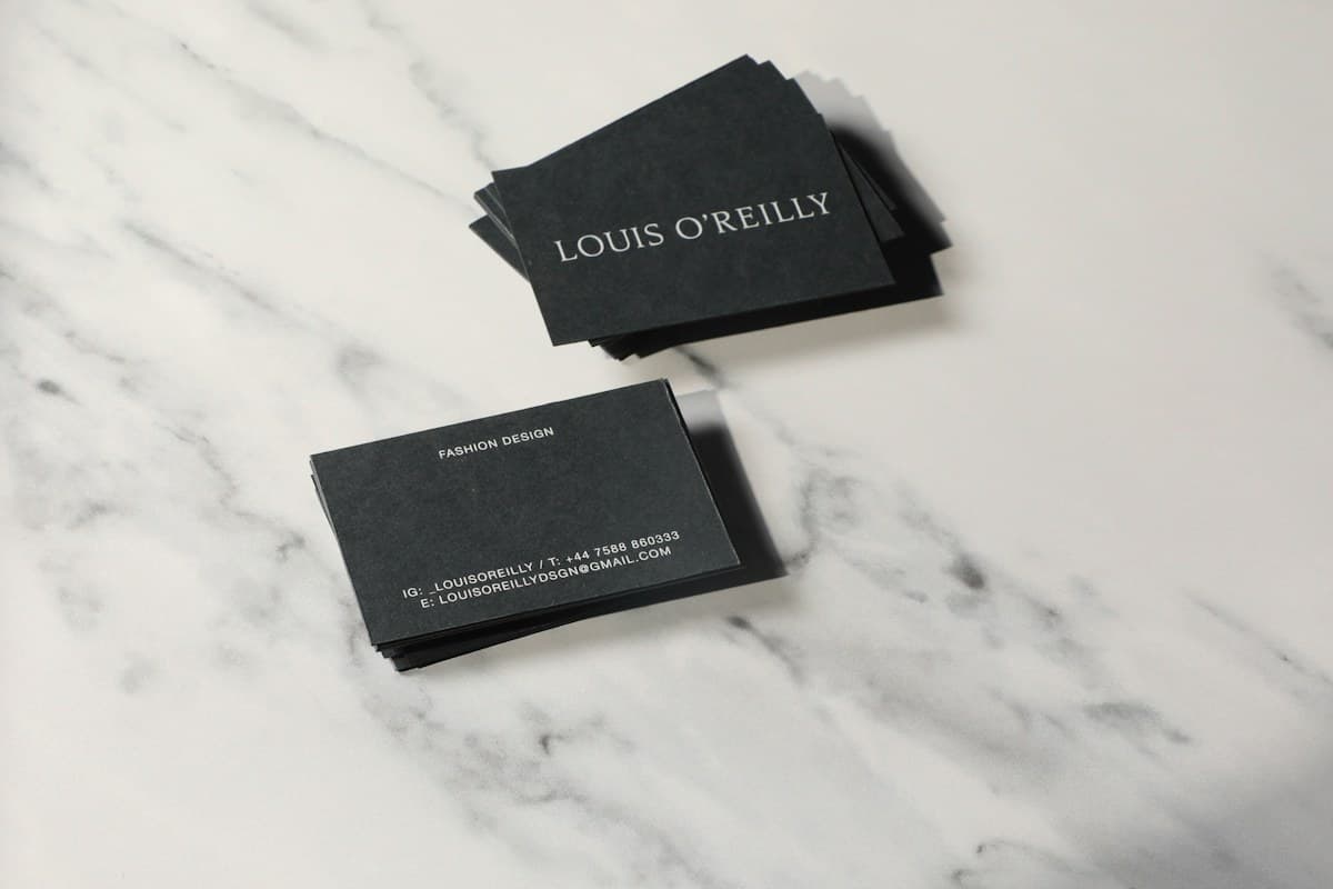

Gold Foil
Original Concepts
NOVVA
Technology
Zentle
Software
Aurelle
Fashion
VERDE
Restaurant
KOVA
Product
LUMEN
Education
PULSE
Fitness
ORYA
Beauty
Skymark
Travel
Brew&Co
Coffee
SHOPLY
E-commerce
Atelier T
Creative Studio
Palette
Type
Guidelines
Packaging
Social
Continue exploring
Logo Design — Types, Categories & Approaches