01
Wordmark
A logo created using the complete brand name as the primary visual identity.
GOOGLE · COCA-COLA · VISA
- Best for
- Brands that want their name to become highly recognisable.
- Key characteristic
- The full brand name is the logo.
Logo types, categories & visual approaches
A logo is more than a visual mark — it represents a brand's identity, personality, values and recognition. Different logo structures are used depending on the brand, industry, audience and communication needs. Below, each of the six main logo types is shown with real examples first, followed by what it is, what it communicates and when it is the right choice for your business.
Where the brand name itself becomes the identity.
Examples
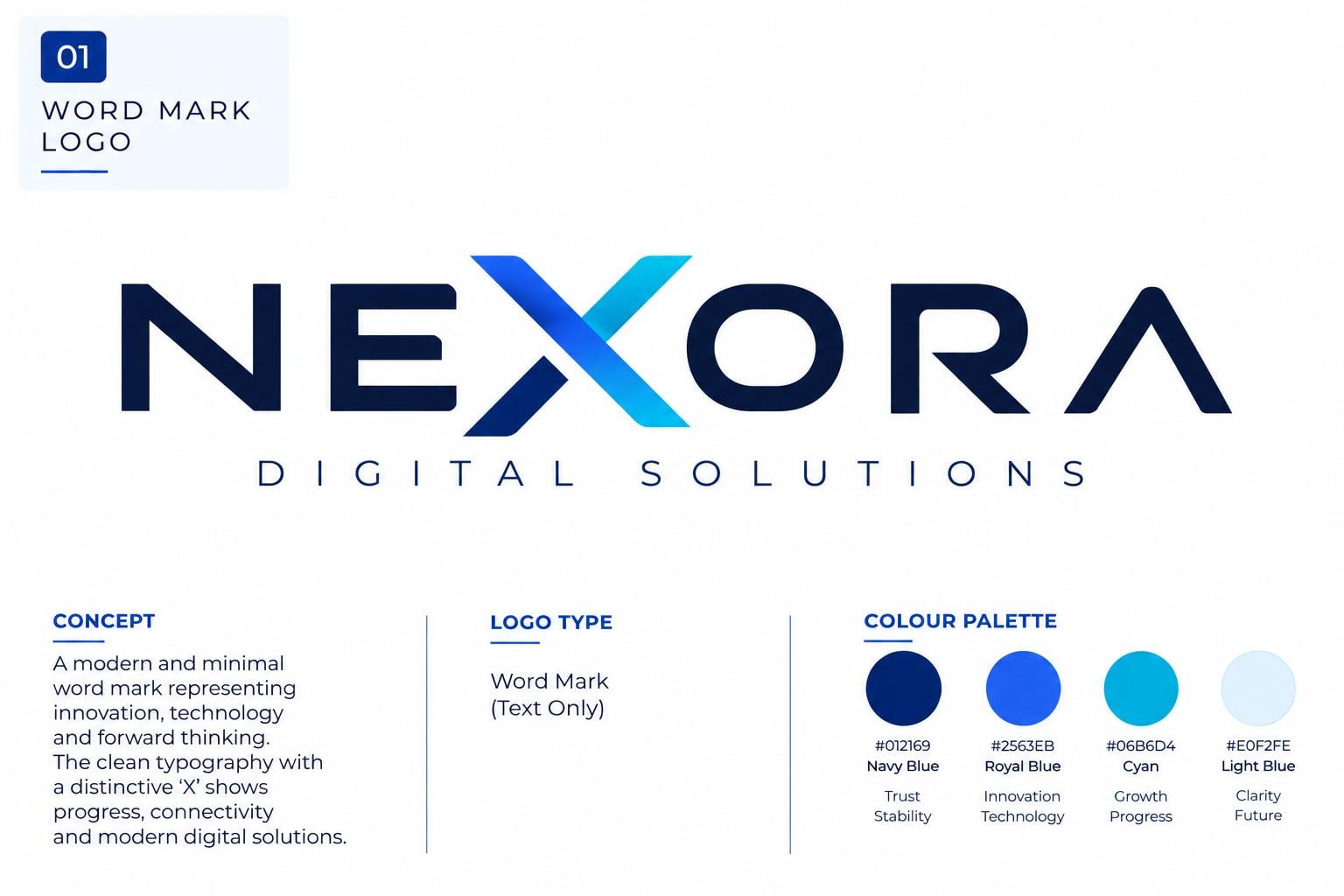
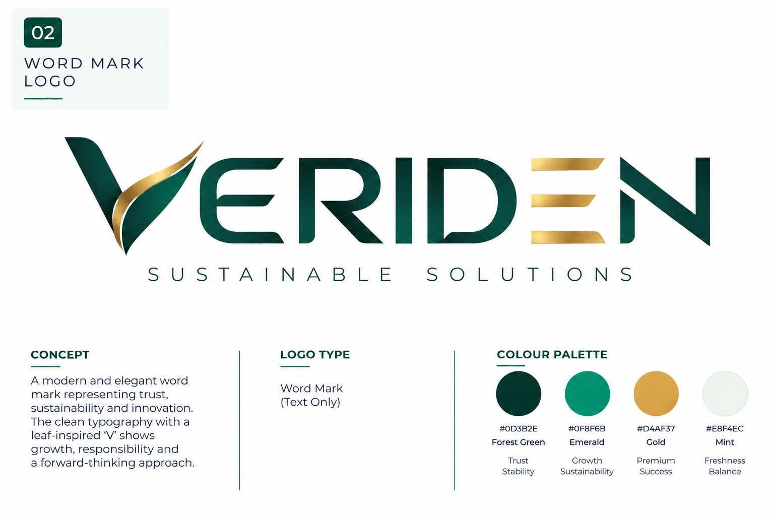
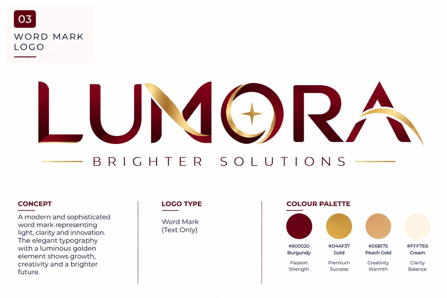
The complete brand name, drawn as the logo.
Brand initials, used when the full name is long or complex.
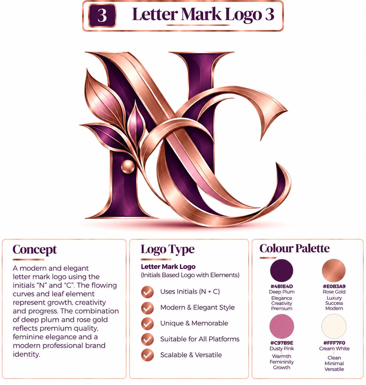
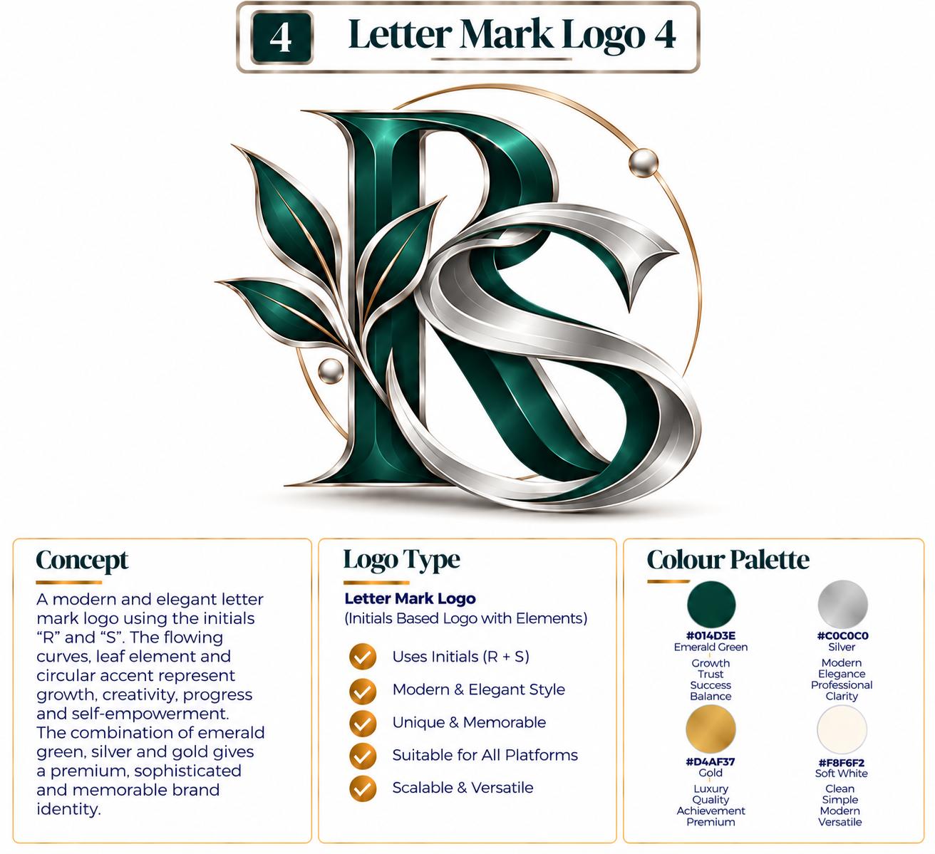
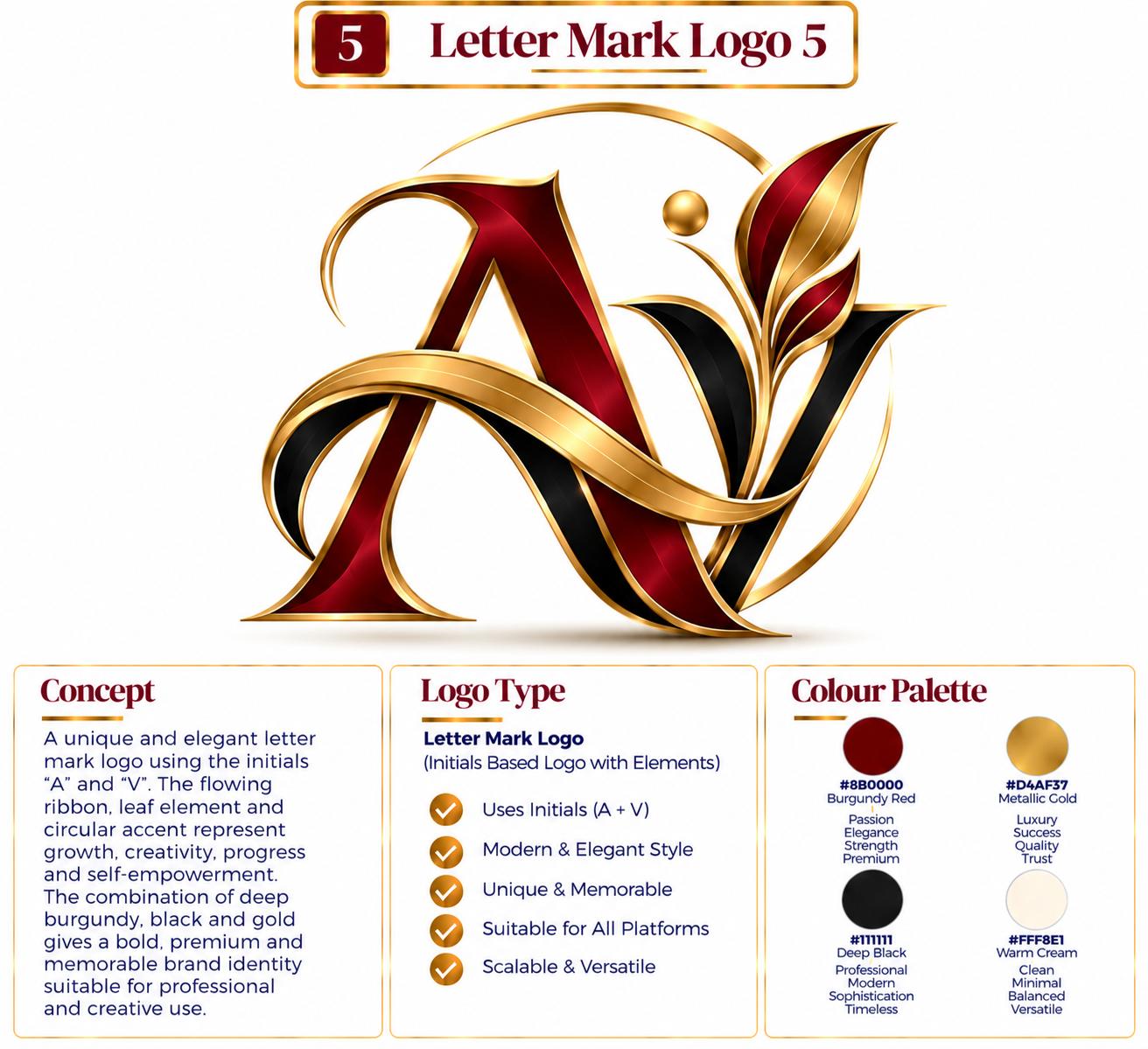
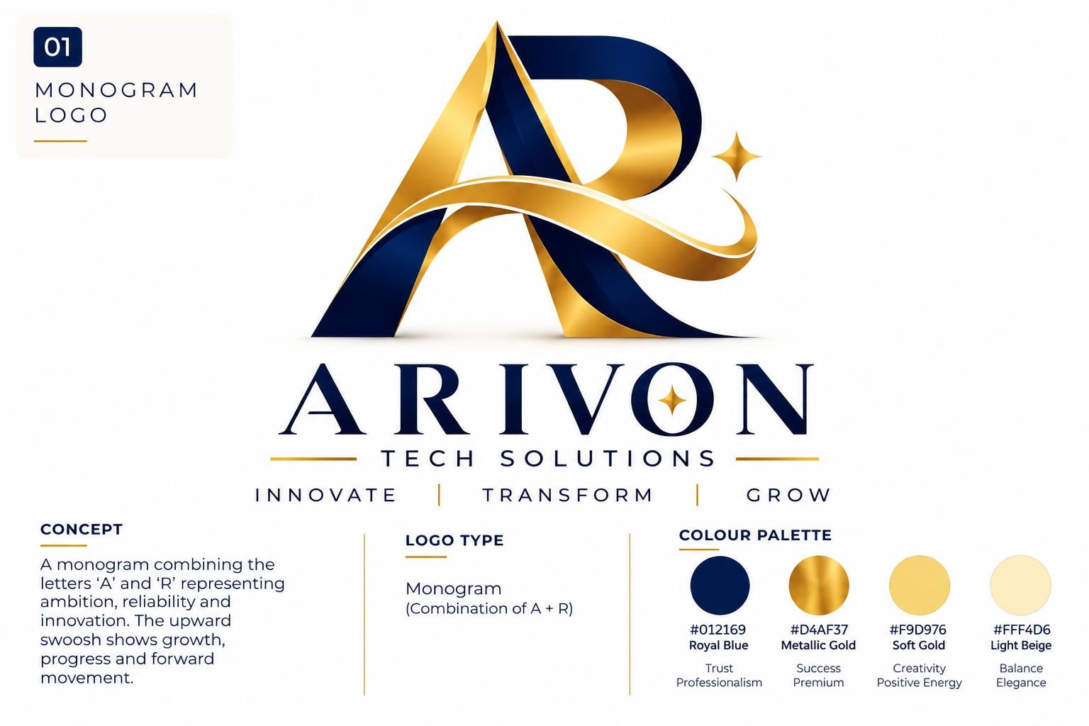
Two or more letters merged into one unified mark.
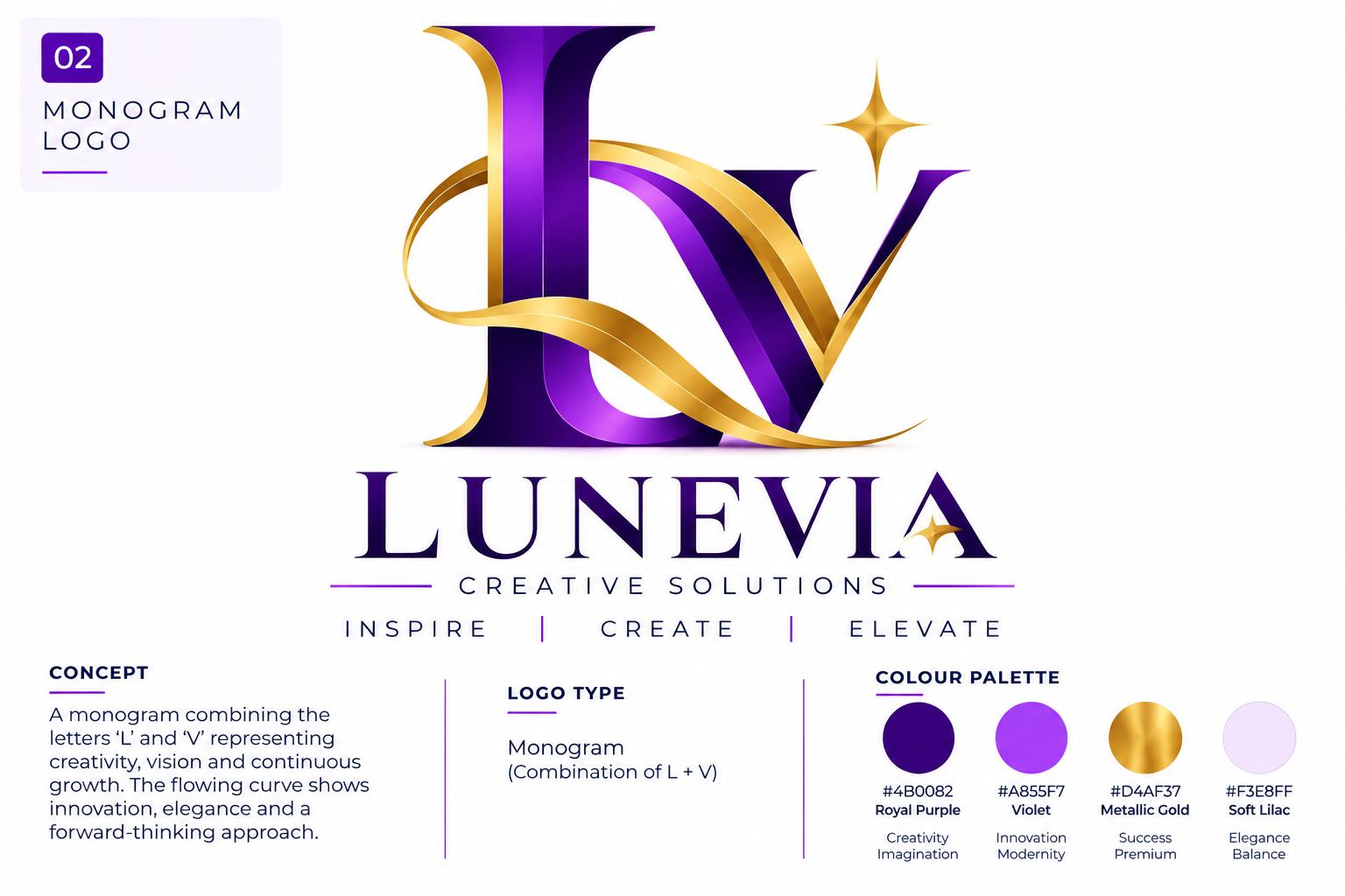
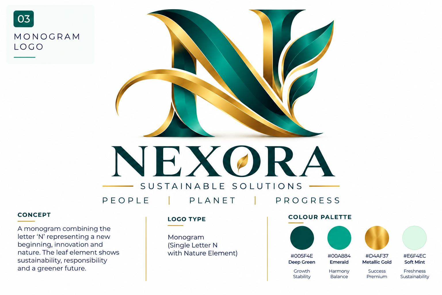
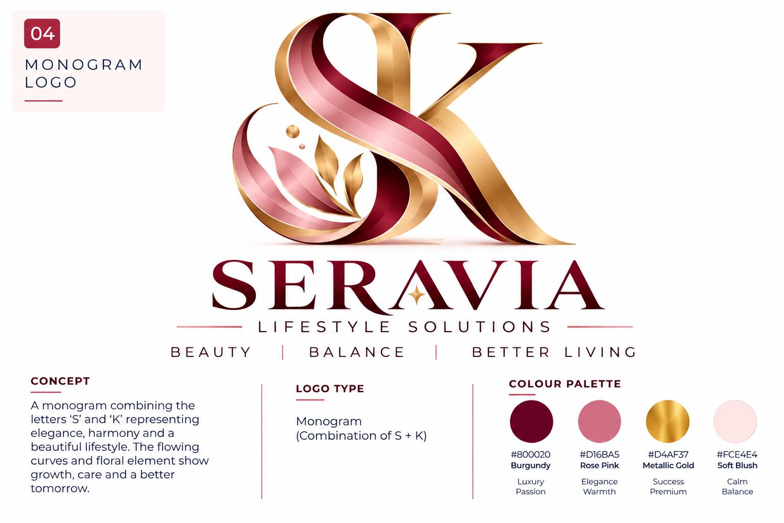
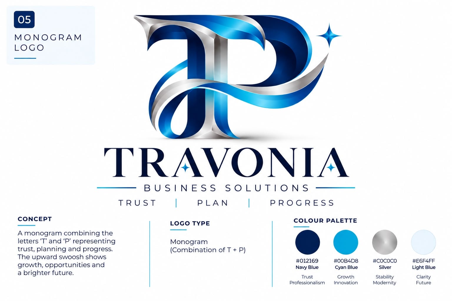
A single distinctive letter carrying the whole identity.
Understanding this logo type
What It Is
A typographic logo is built from letters, words or letterforms rather than from a picture. The name is treated as the artwork — shaped, spaced and balanced until the words alone are recognisable. Nothing extra is needed to carry the brand.
What It Communicates
Typographic marks feel considered, literate and confident. With no illustration to decode, they read as clear, modern and trustworthy — the kind of identity that assumes the work will speak for itself. They feel established rather than playful, and premium rather than casual.
Best For
Businesses with a short, distinctive name that is easy to say and spell. Technology and software companies, law and finance practices, studios, consultancies, fashion labels, restaurants, and any brand whose reputation is built on clarity and professionalism.
Why Choose This Style?
A name is the hardest asset to change and the easiest to remember. A typographic logo makes that asset work harder — it is recognised before it is read, it stays legible at any size, and it dates far more slowly than a trend-driven illustration. It is also the most efficient route to a genuinely distinctive identity.
Design Approach
The designer starts with the brand name, not a template. Typefaces are explored and then modified — letter-spacing, weight, proportion and stroke contrast are adjusted until the name has its own character. The result is tested at favicon size, on a business card and across a full page, because a wordmark that only works when large will not survive real use.
Logo types in this category
A logo created using the complete brand name as the primary visual identity.
GOOGLE · COCA-COLA · VISA
A logo created using the initials of a brand or organisation, usually when the full name is long or complex.
IBM · HBO · CNN
A logo that combines two or more letters into a unified visual form.
Interlocking initials such as T + P, A + R or L + V
A logo built around a single distinctive letter that is custom-designed or visually transformed.
A unique A, B, C, D or E used as the primary brand symbol.
A single visual idea that speaks before the name is read.
Examples
A recognisable object, simplified until it works as a symbol.
A directional stroke that suggests speed, precision and progress.
A non-literal form that communicates an idea rather than an object.
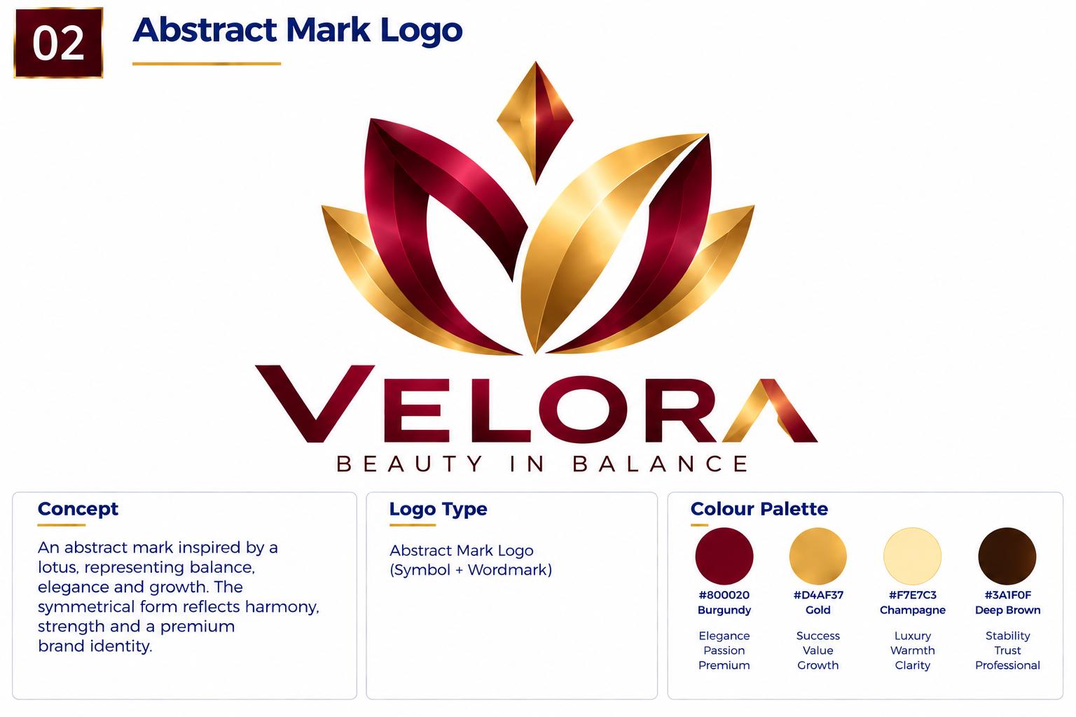
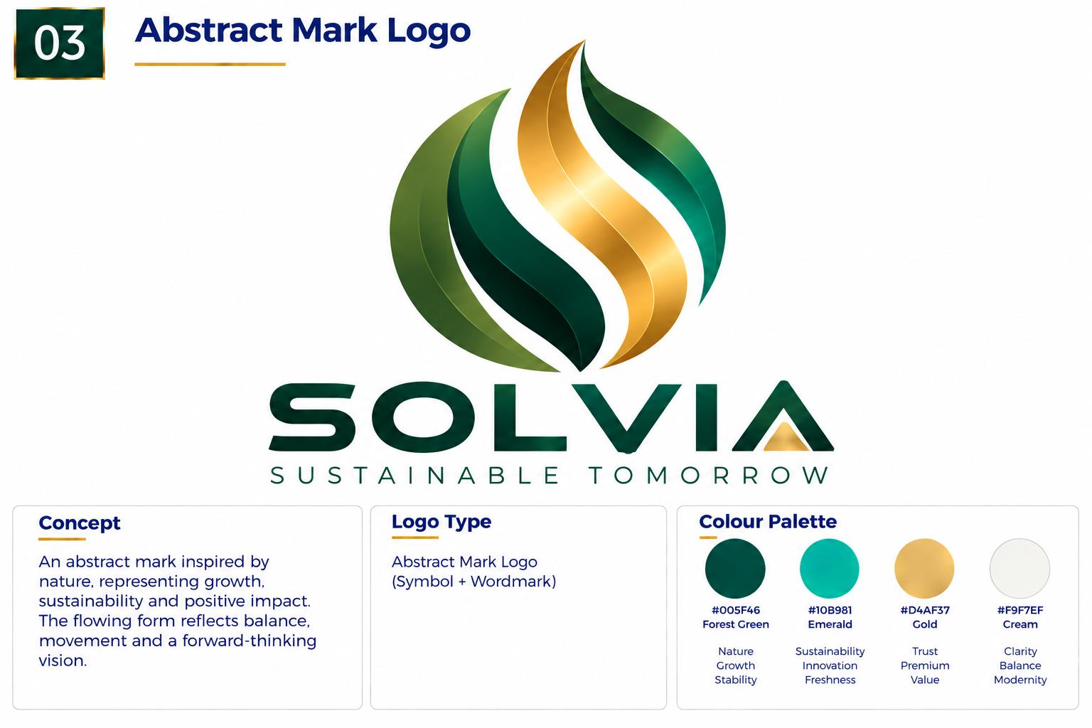
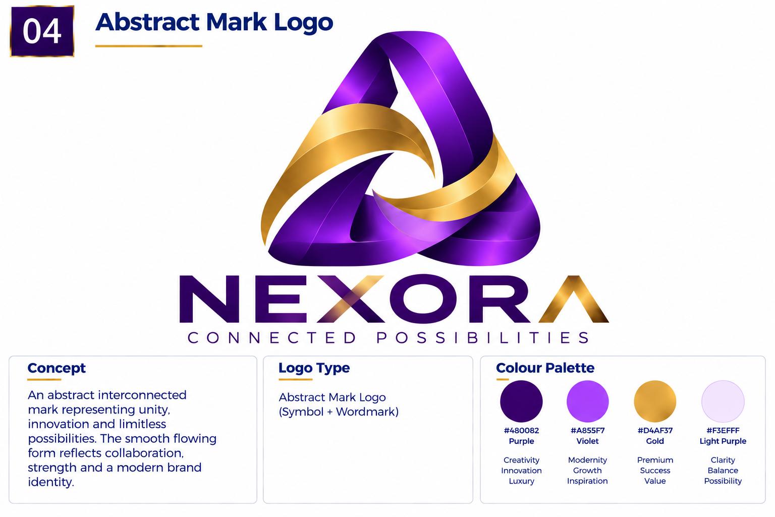
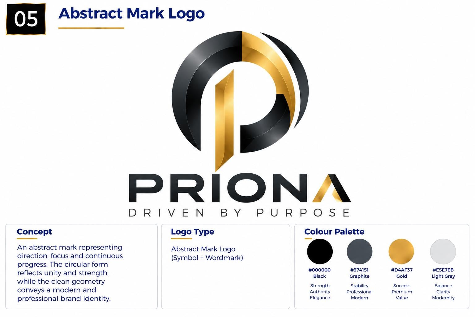
Circles, squares and grids built on precise proportion.
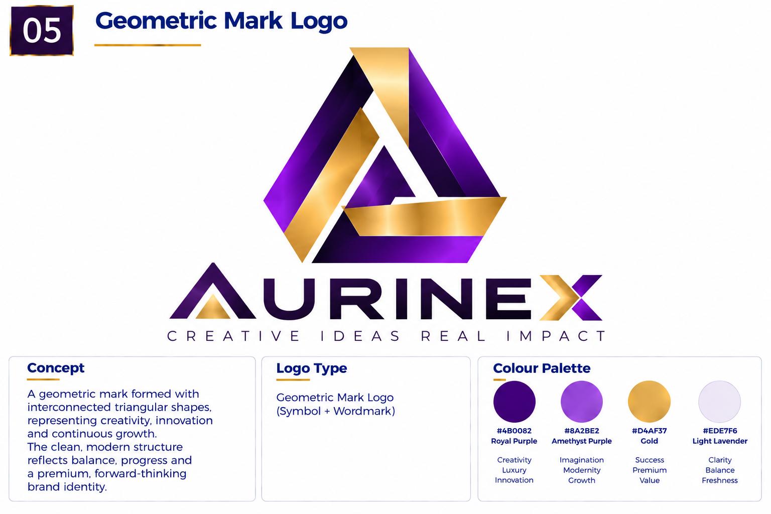
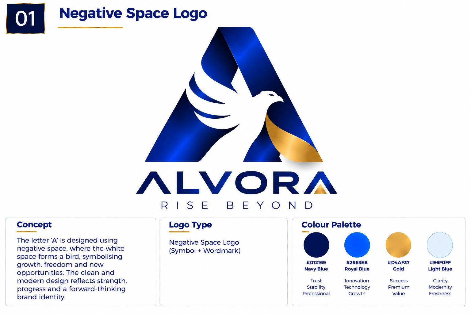
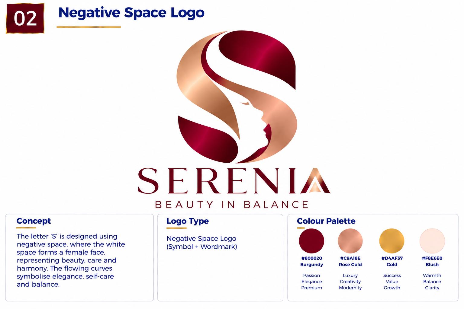
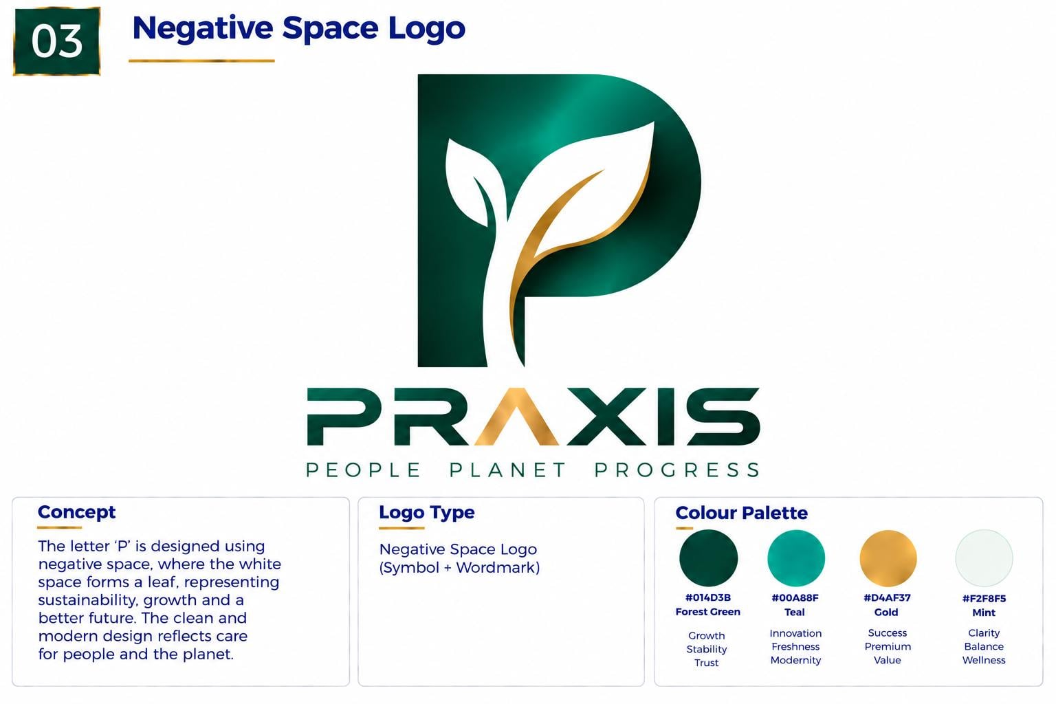
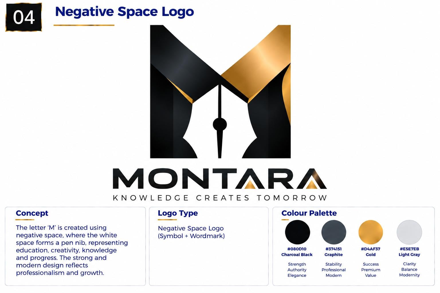
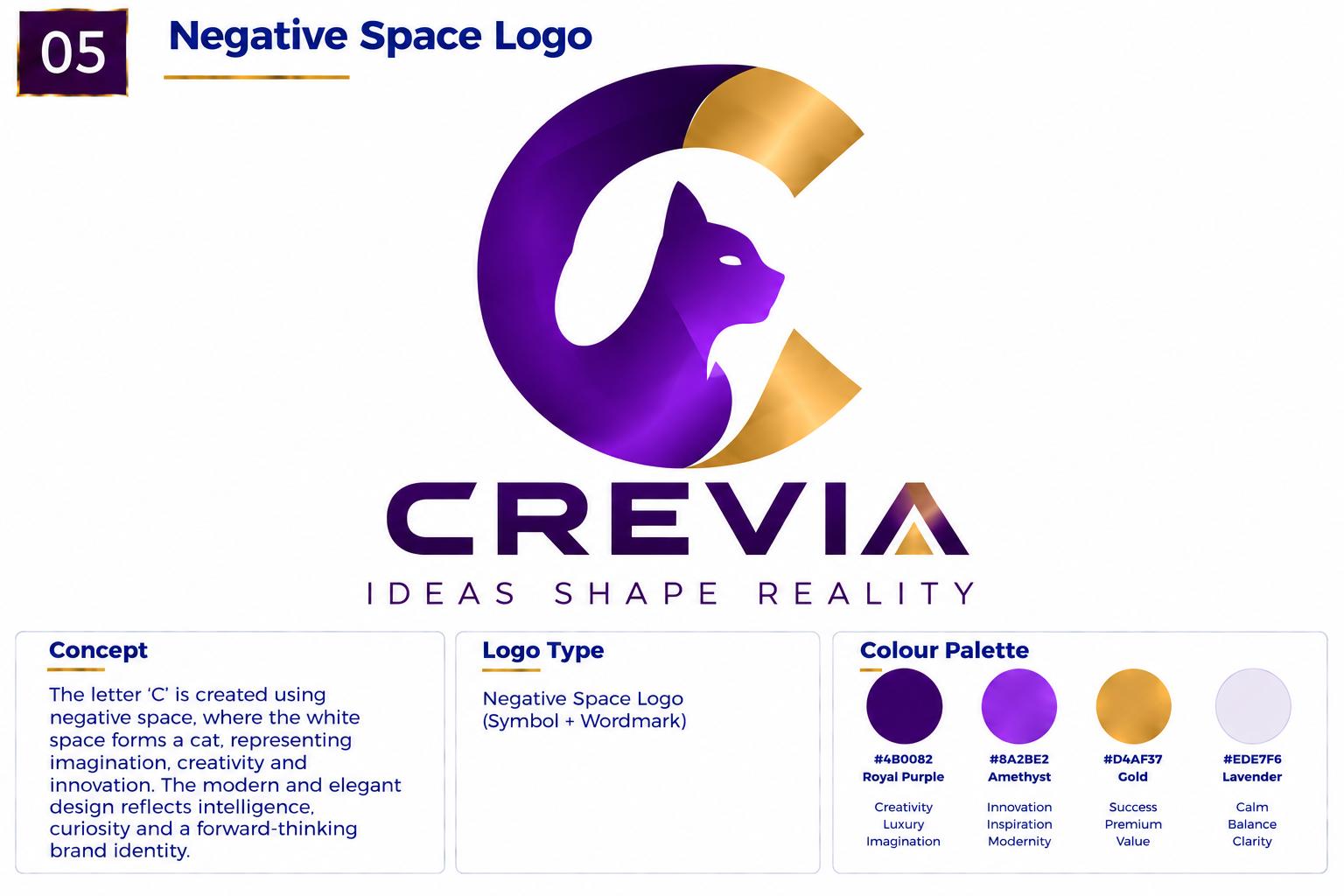
Meaning hidden in the empty space within or around a shape.
Understanding this logo type
What It Is
A symbol-based logo communicates through a picture, mark or shape rather than the full brand name. It can be a recognisable object, a geometric construction, or an abstract form that stands for an idea rather than a thing.
What It Communicates
Symbol marks feel visual and immediate. Because the image is understood before the words, they create fast recognition and a strong memory trace. They give a brand presence that works across languages, sizes and cultures, and they make a business feel confident and complete.
Best For
Brands that need to be recognised at a glance — apps and software, logistics and transport, finance, construction and engineering, retail, hospitality, and any business operating across multiple markets or languages.
Why Choose This Style?
A symbol gives you something to place everywhere a full name will not fit: an app icon, a favicon, an avatar, a stamp, embroidery, a vehicle, or a screen viewed at arm's length. It is the difference between a logo that only works on a letterhead and one that owns every surface the brand touches.
Design Approach
The designer defines the one idea the brand stands for, then reduces it to its simplest possible form. The symbol is constructed in geometry rather than illustration, tested as a silhouette, and checked as a single flat colour before any colour or detail is added. The real test is whether it still reads at favicon size.
Logo types in this category
A recognisable, simplified illustration or real-world object used as the brand symbol.
Apple's apple symbol · Twitter's former bird symbol
A minimalist symbol based on a strong slash, diagonal, line or directional stroke.
A non-literal geometric or organic symbol designed to communicate an idea, feeling or brand personality without depicting a specific object.
A symbol constructed primarily from geometric forms such as circles, squares, triangles, grids, lines and precise proportions.
A logo that uses the empty space within or around a shape to reveal a hidden letter, object or secondary meaning.
A character with personality, not just a mark.
Examples
Drawn characters, figures and personalities built to carry the brand.
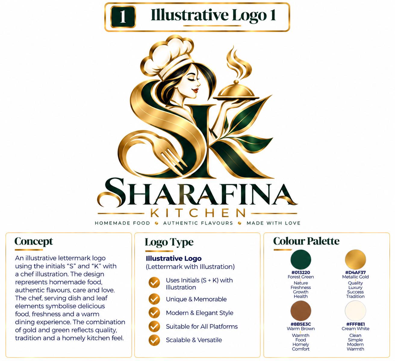
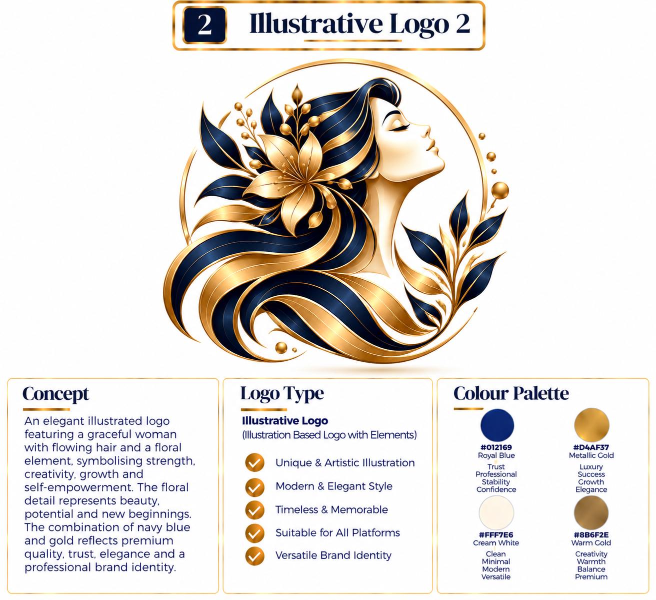
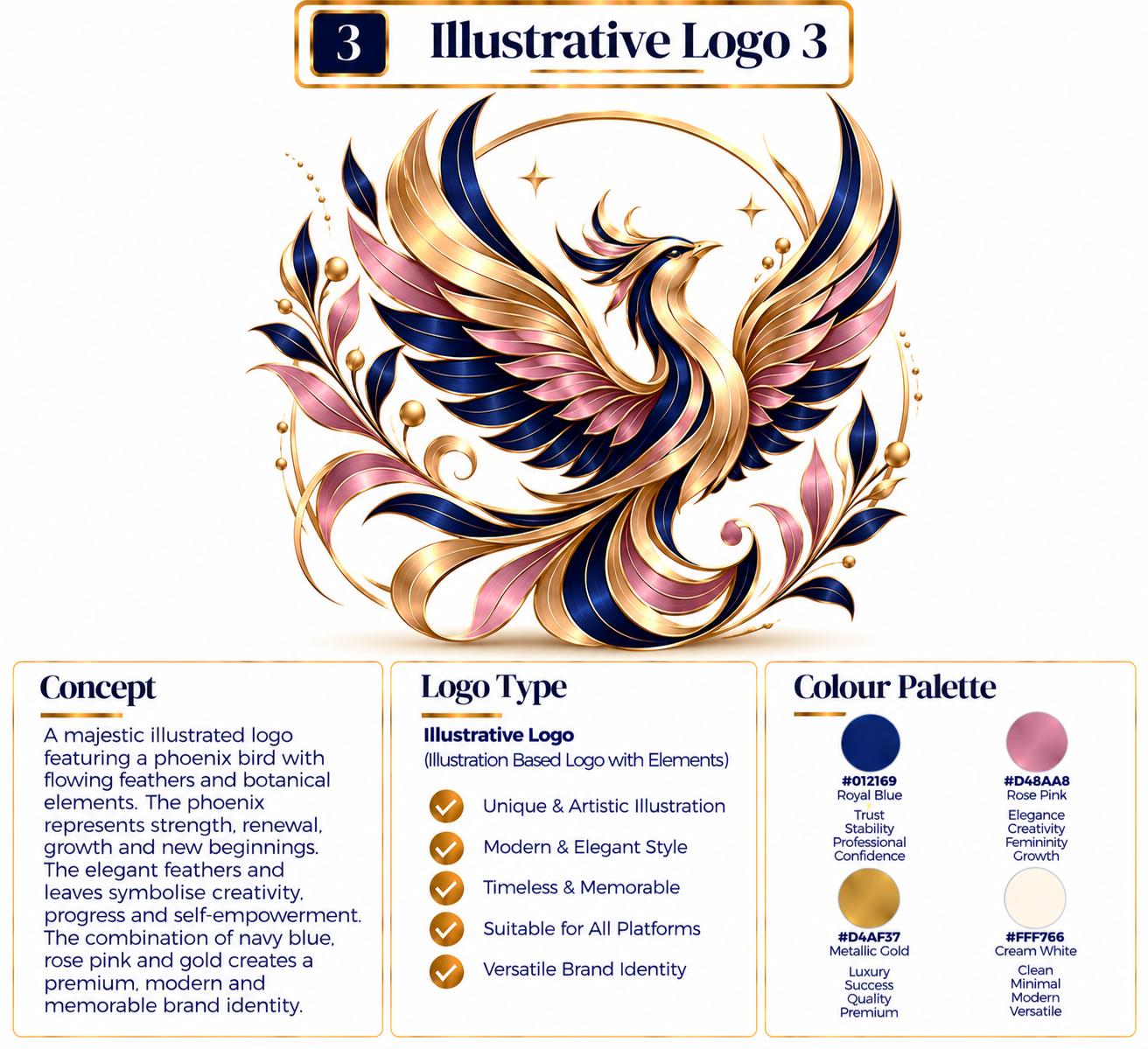
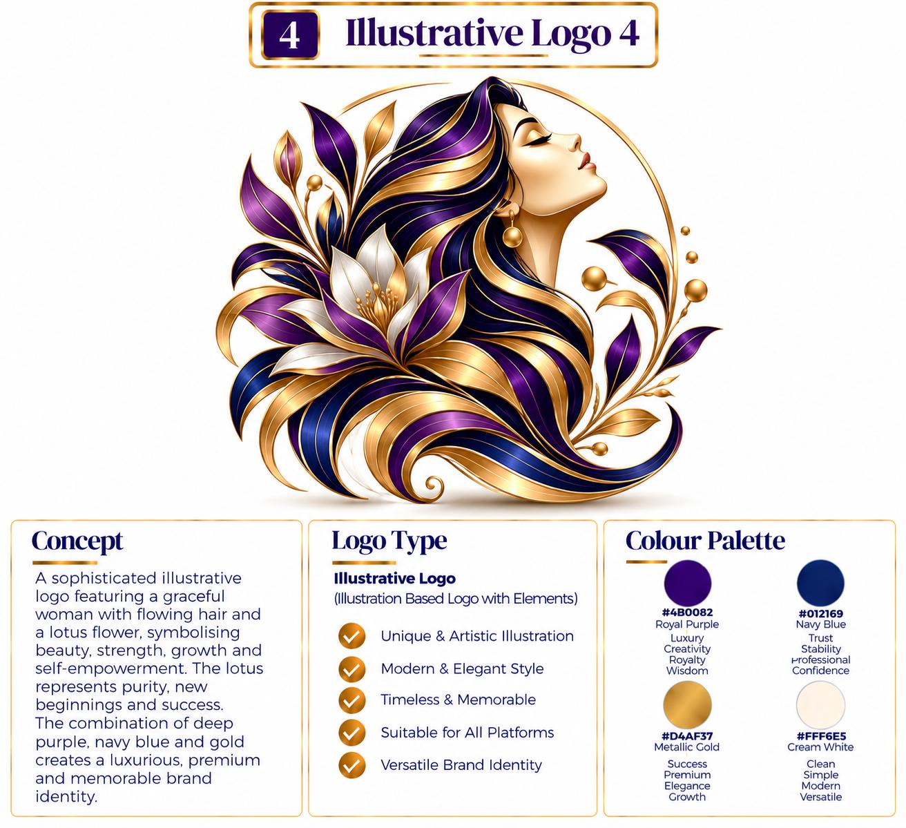
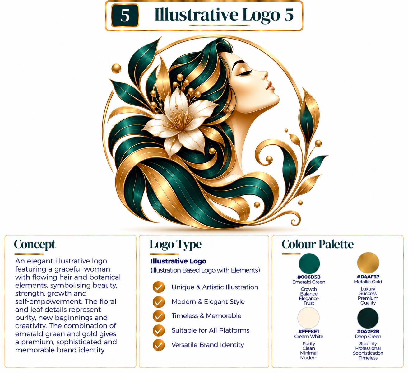
A character that becomes the recognisable face of the business.
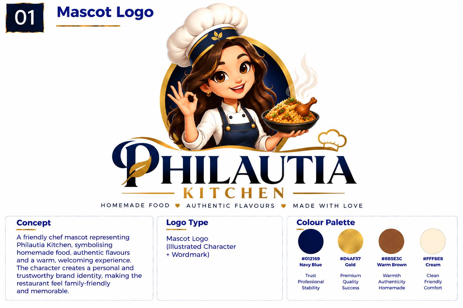
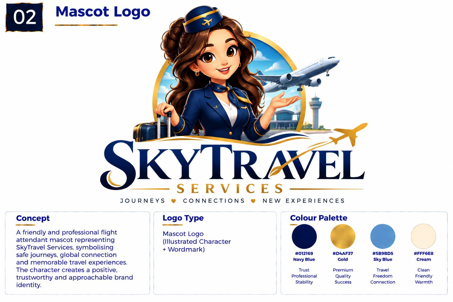
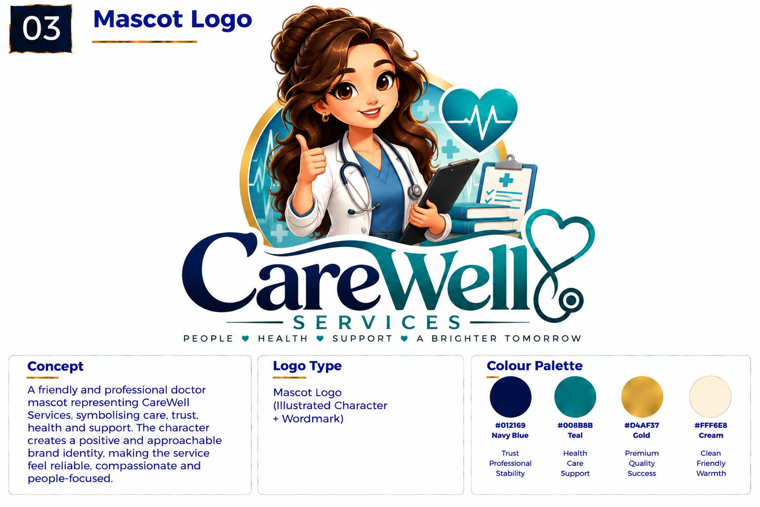
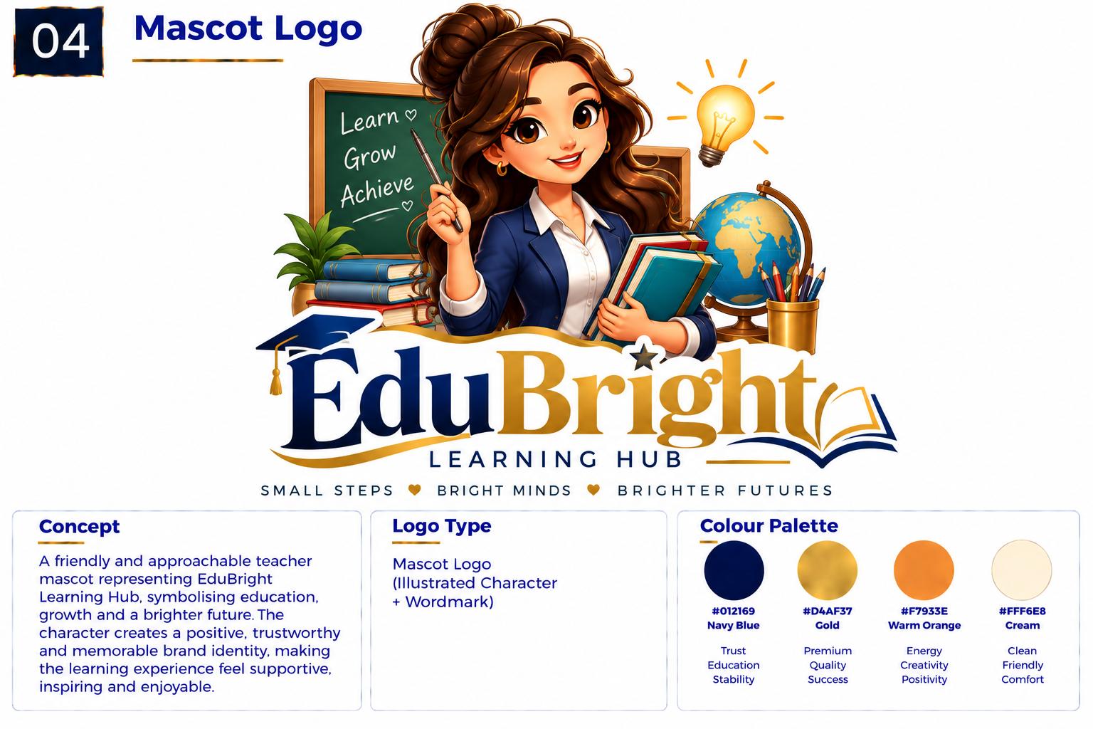
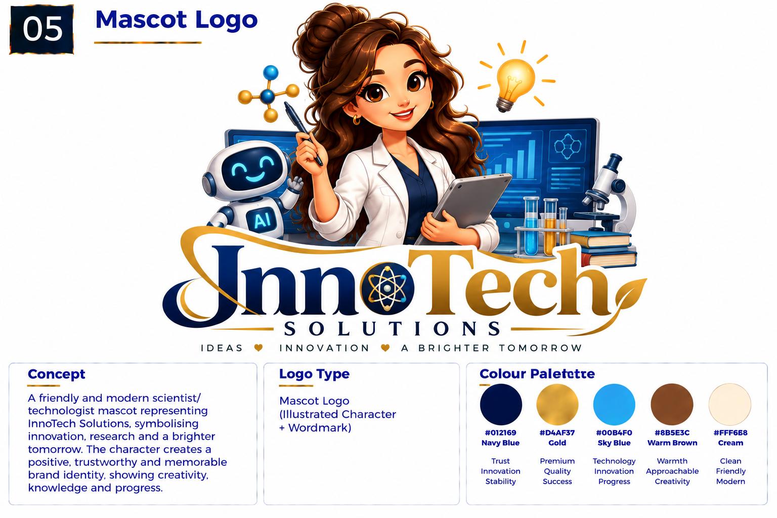
Understanding this logo type
What It Is
An illustrative logo builds the identity around a drawn character, figure, animal or illustrated personality. Illustration gives a brand a face, a tone of voice and an emotional quality that a plain mark cannot carry on its own.
What It Communicates
Illustrative logos feel warm, expressive and approachable. They invite a response — a smile, a moment of play, a sense of personality behind the business. That makes them unusually powerful for brands that are personal by nature, and they age well because people form an attachment to a character.
Best For
Food and drink brands, cafés and bakeries, children's and education brands, sports clubs, gaming and media, retail with a story, family-run businesses, and any brand whose personality is genuinely part of its appeal.
Why Choose This Style?
Illustration creates an emotional connection a geometric mark cannot. It gives a brand something to build content, packaging and social media around — the character can wave, wear seasonal clothing, react to trends and change with the business. It is also the style most likely to be remembered and talked about.
Design Approach
The character is designed around the brand's personality, not around decoration. A designer settles on the silhouette, the expression and a small set of reusable shapes, then builds the identity outward — poses, expressions and seasonal variations that keep the character consistent wherever it appears. Simplicity is essential so it stays recognisable small.
Logo types in this category
A logo built around a character, person, animal or illustrated personality that represents the brand.
Heritage, authority and belonging — drawn inside a frame.
Examples
Symbol and typography integrated inside a badge, seal or crest.
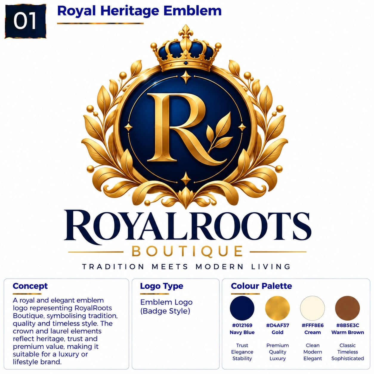
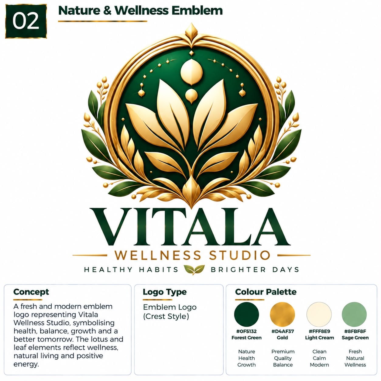
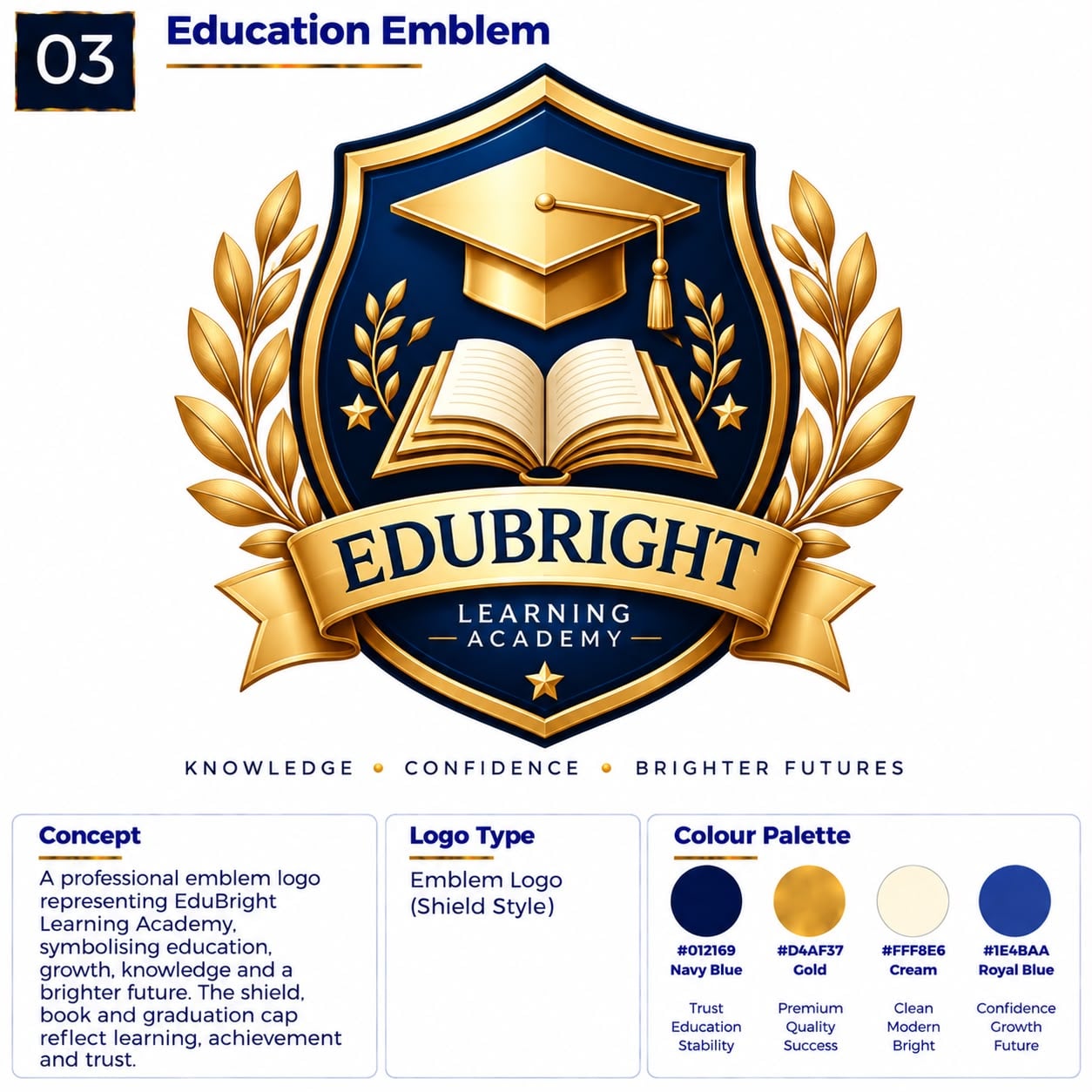
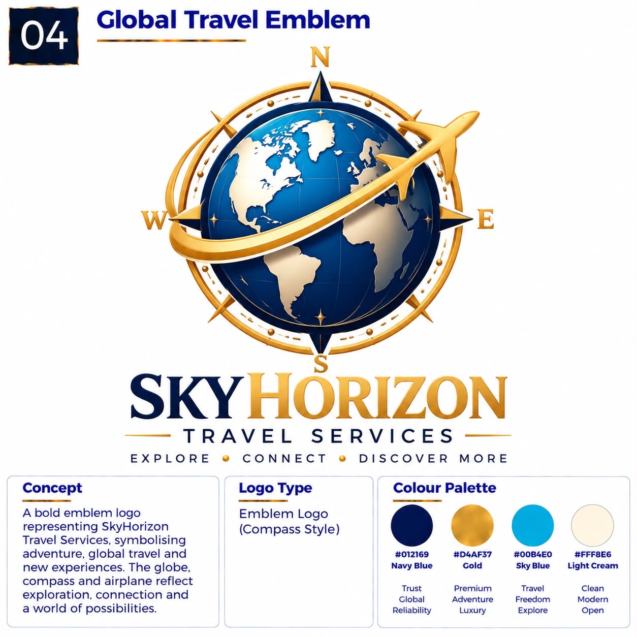
Understanding this logo type
What It Is
An emblem holds typography and imagery inside a unified shape: a badge, seal, crest, shield or circular container. Everything is integrated into one contained composition rather than sitting loose on the page.
What It Communicates
Emblems feel established, official and permanent. The enclosing shape suggests a seal of approval, a heritage mark or an institution, which quietly reassures people that the brand is credible and here to stay. They carry tradition and craft while still working confidently in a modern context.
Best For
Universities, schools and colleges, clubs and sports teams, established hospitality and retail brands, premium traditional businesses, community organisations, societies, and any brand whose value is built on trust, history and belonging.
Why Choose This Style?
An emblem is a complete identity in a single shape. It holds together at a glance, works on signage, uniforms, packaging and merchandise, and gives a brand an immediate sense of scale and permanence. For organisations that need to look established rather than newly formed, it does the work of years of brand-building in one mark.
Design Approach
The container is chosen to suit the brand — circular for unity, shield for protection, crest for heritage. Inside, type and imagery are balanced so neither overwhelms the other, and detail is kept low enough to survive embroidery, foil stamping and small-format reproduction. The outer shape is tested first, because it defines the whole mark.
Logo types in this category
A logo where typography and imagery are contained within a unified shape, badge, seal or crest.
The symbol and the name, working as one system.
Examples
A symbol and a wordmark working as one identity.
A specific, approved arrangement of symbol and wordmark.
Understanding this logo type
What It Is
A combined logo pairs a symbol with a wordmark in a single identity. The symbol carries recognition and personality, the wordmark carries clarity, and the approved arrangement between them is called the lockup.
What It Communicates
Combined marks feel complete and professional. They give the visual warmth of a symbol with the reassurance of a clear name, which is why so many successful identities land here. They suggest a business that is characterful but not risky — creative, and easy to do business with.
Best For
Businesses that want visual recognition and a clear, readable name — technology and product companies, professional services, cafés and restaurants, retail and ecommerce, events, studios, and medium-sized brands that expect to grow.
Why Choose This Style?
You are not choosing between recognition and clarity — you get both. The symbol earns attention and works small; the name keeps the brand findable, searchable and meaningful. Because the elements are designed as one system, each also stands alone, giving you a usable icon, a standalone wordmark and real flexibility across every application.
Design Approach
The lockup is the real work. The designer balances symbol and wordmark in a fixed relationship — position, scale, spacing and alignment are all specified — then tests the approved arrangements horizontally, stacked and compact. The system is documented clearly enough that anyone can apply it consistently, at any size.
Logo types in this category
A logo that combines a symbol and a wordmark in a single identity system.
[Symbol] + [Brand Name]
A professionally arranged combination of a brand wordmark and a symbol in a specific layout.
Symbol + Word · Word + Symbol · Symbol above Word · Stacked Lockup
An identity that lives in motion and adapts to every screen.
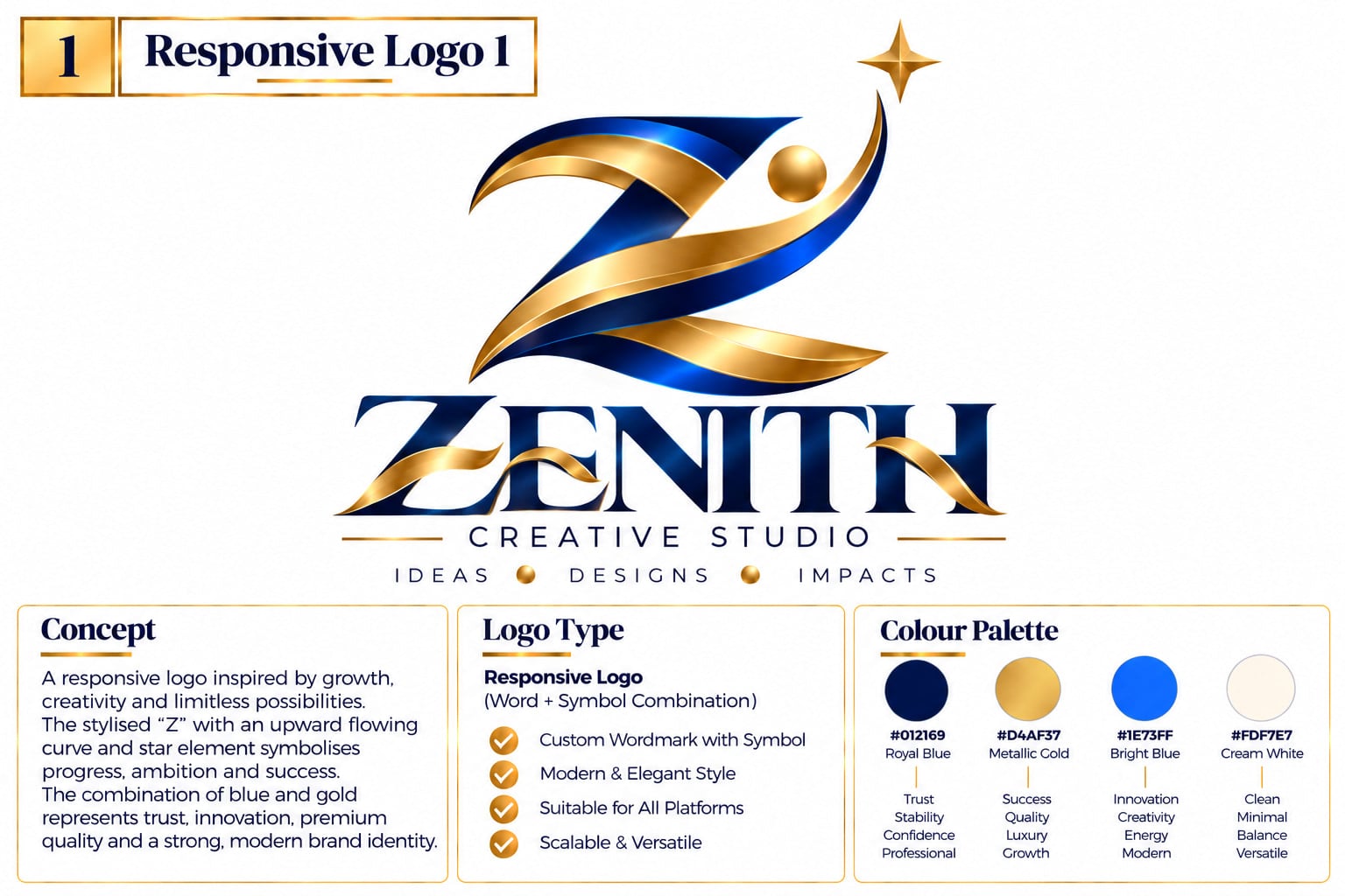
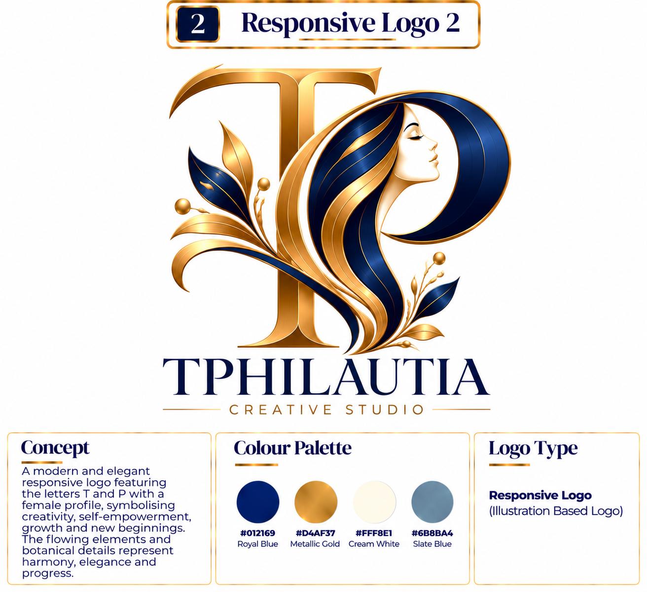
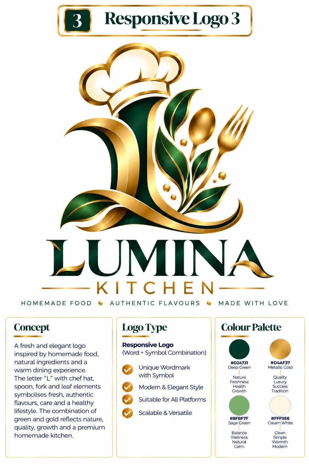
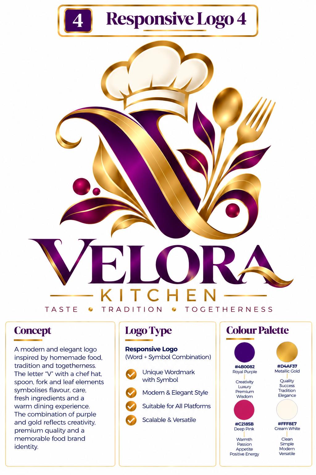
Examples
One identity that changes while holding a recognisable core.
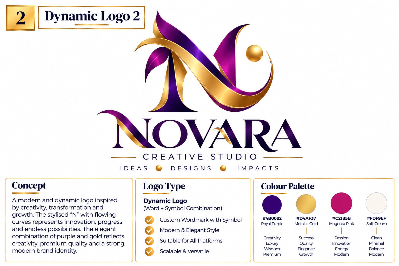
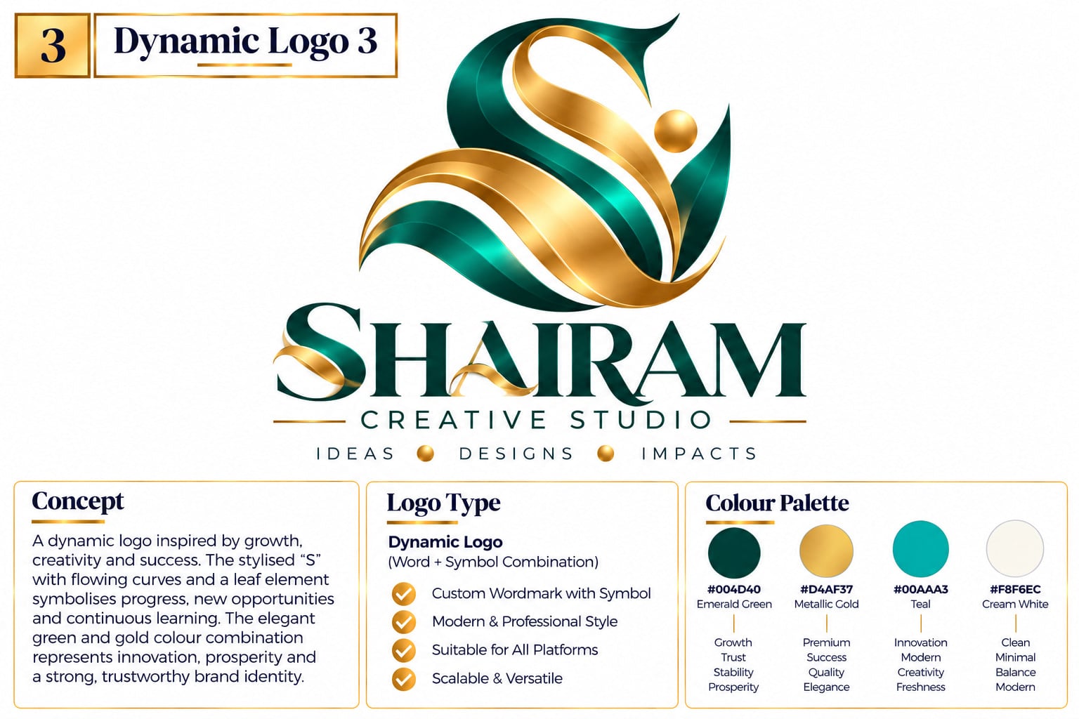
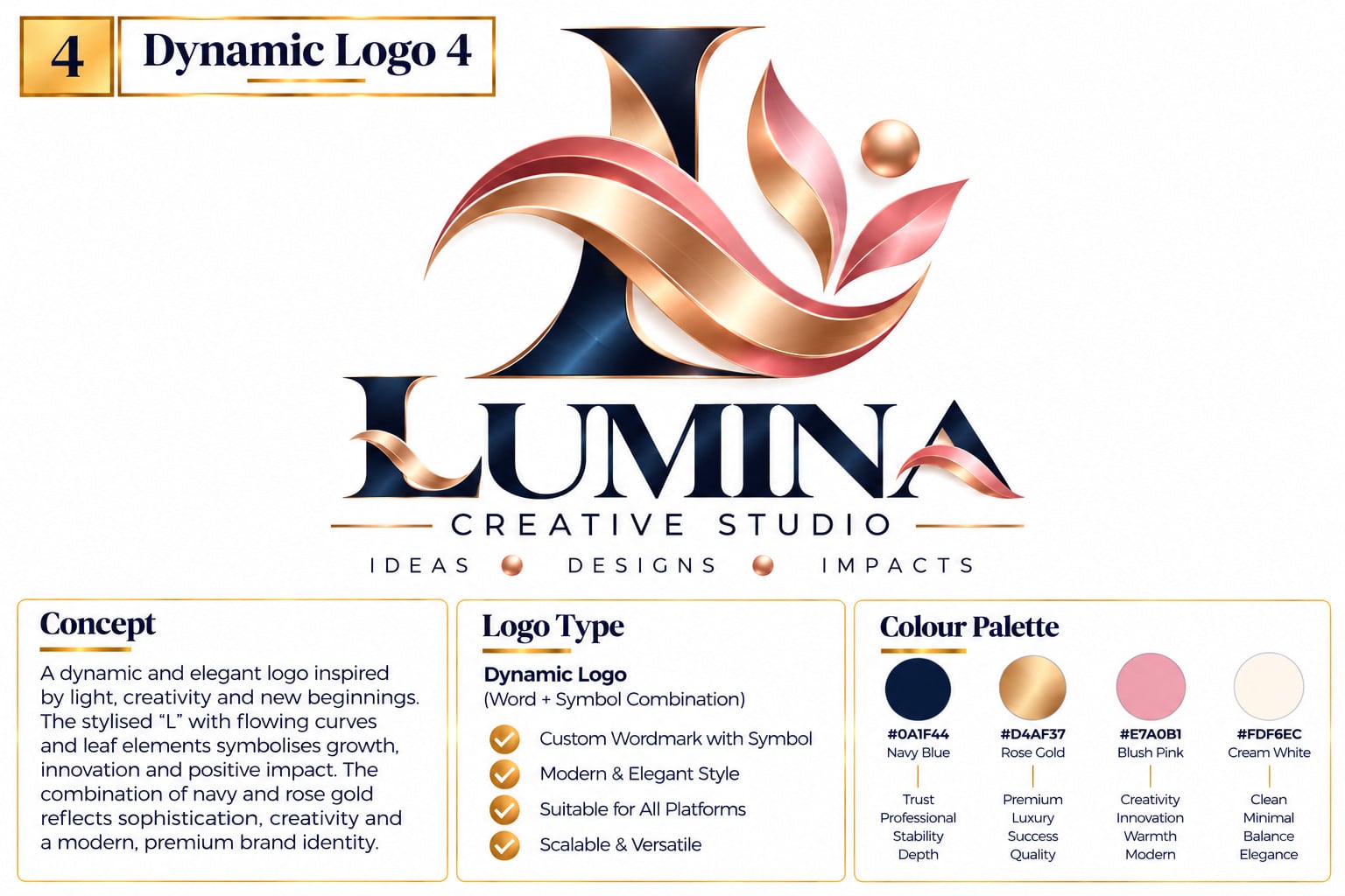
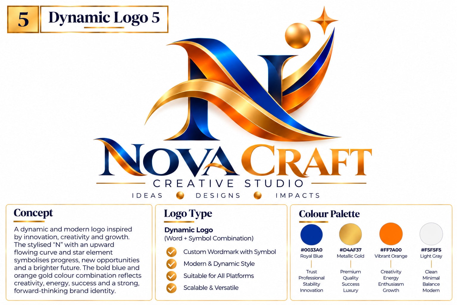
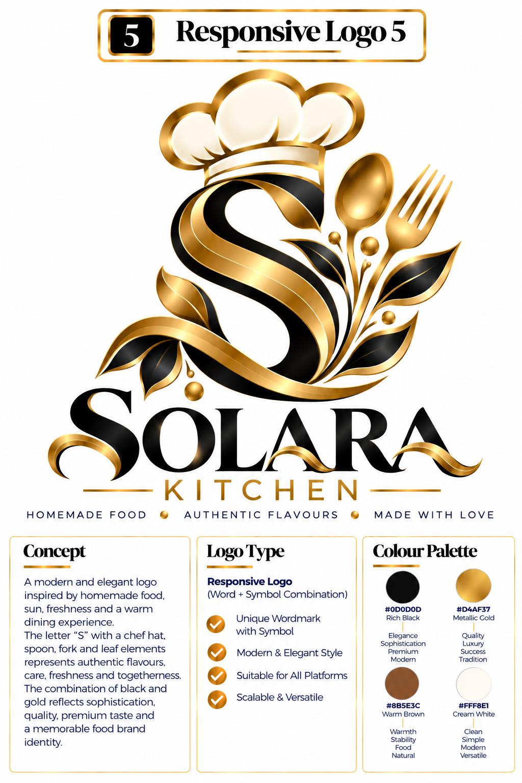
A logo that simplifies itself to fit each screen and space.
Understanding this logo type
What It Is
A dynamic or system-based logo is designed to change while staying recognisable. A dynamic identity varies its colour, pattern, shape or composition over time and across content; a responsive identity simplifies itself to suit different screen sizes and spaces.
What It Communicates
System-based identities feel alive, current and digitally fluent. They signal that a brand is confident enough to evolve — designed for real digital use rather than printed once and forgotten. They also create variety, so a brand stays interesting in feeds, on screens and across campaigns.
Best For
Digital products, apps and software, creative studios, media and streaming brands, technology companies, cultural organisations, events, and any brand that lives primarily on screens — where one static logo would rarely be used twice at the same size.
Why Choose This Style?
Digital interfaces demand flexibility. A logo that works on a desktop header, a mobile screen, a favicon and a social avatar cannot be one fixed image. A responsive system removes that compromise, and a dynamic system turns a static asset into an ongoing source of content — an identity that is technically correct today and still viable tomorrow.
Design Approach
The identity is built as a set of rules rather than one file, defining what must stay constant — the core shape or wordmark — and what may flex: colour, composition, level of detail. Each permitted state is designed and then tested against real constraints: avatar, favicon, single colour, motion, and small print.
Logo types in this category
A logo system that can change or adapt its visual appearance while maintaining a recognisable core identity.
Colour · Pattern · Shape · Graphic elements · Motion · Content · Composition
A logo designed to adapt to different screen sizes, spaces and applications while remaining recognisable.
Desktop
Full wordmark + symbol
Tablet
Compact wordmark + symbol
Mobile
Symbol / initial
Favicon
Simplified icon
Each category answers to a different communication need — from the name-first clarity of typographic marks to the flexible systems that adapt across digital products.
A quick reference of the primary element that drives each logo type.
| Category | Logo Type | Primary Element |
|---|---|---|
| Typographic | Wordmark | Full word |
| Typographic | Lettermark | Initials |
| Typographic | Monogram | Combined letters |
| Typographic | Letterform | Single letter |
| Symbol-Based | Pictorial Mark | Recognisable object |
| Symbol-Based | Slash Symbol | Line / directional form |
| Symbol-Based | Abstract Mark | Conceptual symbol |
| Symbol-Based | Geometric Mark | Geometric structure |
| Symbol-Based | Negative Space Mark | Hidden visual meaning |
| Illustrative | Mascot | Character |
| Emblem | Emblem | Badge / seal |
| Combined | Combination Mark | Symbol + word |
| Combined | Word + Symbol Lockup | Structured symbol + word arrangement |
| System | Dynamic Logo | Changing identity |
| System | Responsive Logo | Adaptive identity |
At TPhilautia Creative Studio, logo development focuses on creating identities that are simple, strategic, technical, professional, memorable, scalable and distinctive — not simply attractive, but functional across every brand touchpoint.
Brand Purpose → Concept → Logo Structure → Typography → Symbolism → Colour → Scalability → Digital Application
The goal is not simply to create a visually attractive logo, but to build a clear and functional visual identity that works across websites, mobile applications, social media, print, packaging and other brand touchpoints.
Let's create a logo that gives your brand a distinctive identity
Share your brand, your industry and the direction you like from the examples above. You'll receive a clear recommendation on the right logo structure, the scope of the work and what it includes.